


 Bad Data and Bad Decisions: Facebooks’s Sinking IPO – An infographic by the team at Data Quality Infographic
* * *
“Facebook IPO” image courtesy of Shutterstock.
Bad Data and Bad Decisions: Facebooks’s Sinking IPO – An infographic by the team at Data Quality Infographic
* * *
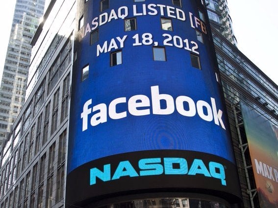
“Facebook IPO” image courtesy of Shutterstock. The Facebook IPO timeline
I admit it. When I stated in June, 2011, that Facebook would be the worst tech investment in history, I didn’t know how bad it was going to get. I knew it was going to be awful. I just didn’t realize it was going to be THIS awful.
Despite the follies, the company is still going strong. They’ve licked their wounds from the poor launch, watched as people became super rich overnight, then about half as rich a couple of months later, and kept with the vision of expanding the network and improving the service. So far, it’s really not that bad (as long as you’re not one of the initial investors) but it’s still funny to take a look at where they’ve been the past few months. This infographic does just that. Enjoy.
Bad Data and Bad Decisions: Facebooks’s Sinking IPO – An infographic by the team at Data Quality Infographic
* * *
“Facebook IPO” image courtesy of Shutterstock.
Bad Data and Bad Decisions: Facebooks’s Sinking IPO – An infographic by the team at Data Quality Infographic
* * *
“Facebook IPO” image courtesy of Shutterstock. More Stories From "News"

Meta is under intense scrutiny after newly unsealed court documents revealed internal discussions about using copyrighted content, including pirated books,…

Raise in the Subscription Cost Plans: According to the most recent reports of the company, Netflix subscription cost plans in…

Reports of Russia allegedly attempting to hack the whatsapp accounts that belong to government ministers and top-ranking officials across the…

Android recently unveiled their newest operating system, Android 6.0 Marshmallow. It doesn’t entirely overhaul the system, but it does bring…