August 27, 2012

After 25 years, Microsoft finally changes up their look

Windows New Look

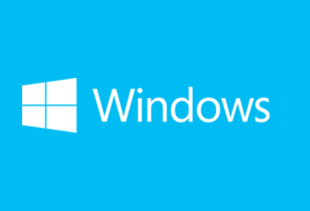
They have had the same familiar look and feel for the majority of their products and services for a quarter of a century. Now Microsoft has changed things up ahead of their Windows 8 release. The bottom line to the new looks for their product logos: simple.

They have take a page our of both Apple and Google’s playbook and simplified their logos, making them cleaner and singular in form and focus. This short video breaks down the changes:

Disclosure:

Some of the links in this article are affiliate links and we may earn a small commission if you make a purchase, which helps us to keep delivering quality content to you.

Lorie Wimble

Lorie is the "Liberal Voice" of Conservative Haven, a political blog, and has 2 astounding children.

Leave a Reply

Your email address will not be published. Required fields are marked *

Similar Stories

Apple to Bring AI Features and Spatial Content App to Vision Pro – Report

Apple to Bring AI Features and Spatial Content App to Vision Pro – Report

February 16, 2025

Apple (AAPL.O) is preparing to roll out major AI-powered enhancements to its Vision Pro headset, including a new spatial content...

6 main elements of beautifully designed smartphone apps

6 main elements of beautifully designed smartphone apps

January 30, 2024

The importance of mobile design really cannot be exaggerated these days. In 2014, 60 percent of web traffic came from...

#Infographic: Logo design evolution

#Infographic: Logo design evolution

November 18, 2022

One of the most common uses of design skills is the production of logos. Companies pay a lot of money...