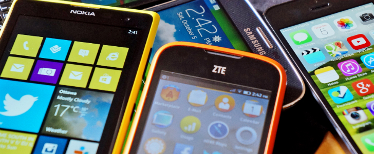
First Depressions: iTunes 10, As Told by An Audiophile
More than a few times, Techi readers have called me out in the comments section about my abuse of the word ‘rad’. Indeed, some have even refused to believe my endorsement or recommendation of a service, product or idea unless I say it. Suffice it to say, it seems to be my catchphrase.
But let me tell you about something that isn’t rad. Something that could be rad, but verifiably isn’t. For now. That something is iTunes 10. I literally stayed up all night, moving some new music and fiddling around with the latest version of Apple’s music player, and guys. I have got to say. I’m not impressed.
Now, bear in mind, I was a huge fan of iTunes 9.2. I’m an enormously pretentious hipster audiophile, and I have thousands upon thousands of obscure releases, all perfectly categorized and tagged, with re-touched album art. In short, I love my music and, being on a Mac, iTunes is was pretty much the perfect tool for keeping it all organized (to all the Songbird disciples out there: no. Just no.). I never turn it off. A clean interface, a snappy, smooth response (remember, we’re talking Mac here… I really do sympathize with you Windows iTunes users), iTunes, up to 9.2, was the bob-omb. I waited all day with bated breath to get my hands on iTunes 10. All day. All. Day.
But I’m on hour fourteen of my iTunes 10 experience, and overall? It’s just not measuring up. To put it in the nicest possible terms, I have a few gripes with the new iTunes (yes, Ping too – calm down, we’ll get to that), and looking at my RSS feed, I’m not alone. Maybe it’s the lack of sleep talking. But I doubt it. Let’s rap, guys. Let’s zip zap rap.
The Branding

I’ll be honest: the new iTunes logo, while not much stronger a brand identifier than the original boring-as-tits iTunes logo, is probably my favorite part of the new iTunes. When Big Steve put on his shit-eating grin and smarmily (yeah, makin’ up a new word here) dismissed the CD as irrelevant in the age of the iTunes Store yesterday afternoon, I threw back my head in laughter, and gave him a cosmic high five. Personally, I have the iTunes Store disabled – I like a clean sidebar – but I just loved Jobs’ attitude in unveiling this feature. And it makes sense – who the hell is using CDs anymore? Cheeky, yes, but total branding win. But, unfortunately, that’s all the points iTunes is gonna win today.
The Interface
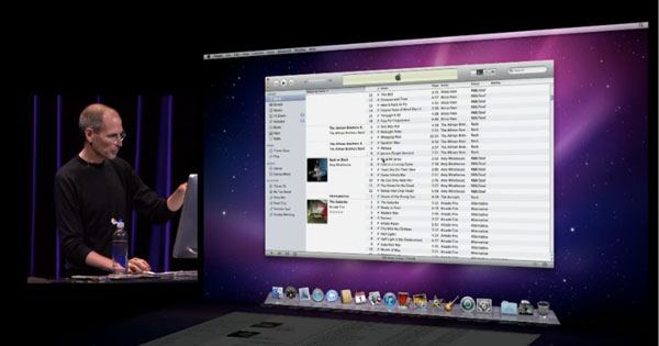
Here’s where it all fell apart: when I opened iTunes 10 for the first time and was met with what I can only term a total f***ing mess. Now, I fully understand the initial shock that accompanies any version-to-version interface tweak, but this is not that. This is clearly Apple telling all their UI designers to hit the road. Did Jobs design this himself? This is music app Dadaism, right here. Let’s go over some of the highlights, shall we?
The Sidebar
I don’t really use the sidebar that much; if I could turn it off, I would. But one thing’s bugging me, and while most would probably call me a whiner, this is more important on an unconscious level than you might think: the sidebar icons are now colourless. Where once you could hit sidebar items without them even exiting your peripheral vision, you now must focus your attention, if only momentarily, to read the sidebar before making a menu choice. Of course, this is by no means a total dealbreaker, but it certainly slows the experience, and noticeably so for a power user. No, I don’t spend all day whipping back and forth from Podcasts to Music to Podcasts. This is just Interaction Design 101, and Apple’s blowing it.
Sadly, though, they haven’t even gotten started. With the blowing, that is.
The min/max/close Buttons
Okay, this is where I’d most believe that Jobs designed this himself. I mean, think about it: the guy’s been staring at more or less the same window interface configuration for almost thirty years. Maybe he wants a change. But… turning the buttons on their side and shrinking them? Welcome to World’s Drunkest Designers. The window buttons are consistent across an operating system for a reason – that reason being, of course, that the user doesn’t need to think. They don’t need to shift 100% of their attention, even for a split second, to performing such an (ideally) transparent task as closing a goddamn window. So what’s all this, then? This is my music player, least of all should I be shifting that split-second of my attention to my music player. As with the sidebar issue, this is a hindrance to unencumbered usability.
Luckily, though, it doesn’t have to be! This is one Horror Of iTunes Ten you can actually undo, with the help of your trusty Terminal! That is, if you’re not terrified of Terminal. I feel that. I used to be. But you can do it! Believe in me, who believes in you. Just open up Terminal, type (or copy/paste) “defaults write com.apple.iTunes full-window -1“, and bam. Your window buttons are back to normal. Dodged a bullet there, huh?
The Volume Slider
What. The hell. Is this.
The Classic List View
Actually, I’m really glad this view is back – you know, the one with all your albums in a single list, with accompanying art. But one thing kind of sticks out, and you may not notice right away. I’ll try to explain. In previous iTunes versions, the list of tracks (on the right) always yielded to the album info (on the left: Artist, Album Title, artwork, rating), so that the album art could be displayed. This often created blank space if there weren’t many tracks in an album, but that was okay. It broke the list into identifiable segments, by album, making things easier to find. However, in iTunes 10, the album info (again, on the left) now yields to the list of tracks. This isn’t so bad, but it leads to weird holes like this:

Where’s the album art? At a glance, I could scroll right by this. It’s even worse for single-track albums. Again, hampering a quick, intuitive user experience.
There are more nits I could pick with the new interface, but you get the picture: iTunes 10 is a step backwards in the UI department, and that’s a scary thought – mainly because iTunes’ interface often gives a peek into the future of OS X’s. Ouch.
Be that as it may, though, minor iTunes updates often tweak the UI considerably, so maybe this is an experiment. Maybe we’ll see an improvement. Here’s hoping.
The Speed
I’m on an 8-core Mac Pro. My Mac does the opposite of suck out loud. And even then, iTunes 9.2’s silky smooth scrolling through thousands of tracks has been reduced to a choppy hell. I’m confident this will be swiftly addressed in an upcoming update, but… wow, guys. It’d better. Songbird’s actually not sounding too bad if this continues.
Ping
Yes, fine, we can talk about Ping now. Hoo, boy, where to begin. I guess I should tell you about what I (and, very possibly, you) thought Ping was going to be.
I thought Ping was going to be a heaven for the music enthusiast. For months, I pimped iTunes 10’s upcoming ‘social integration’ to friends, vibrating with excitement over what sorts of features it would offer, wondering if I’d be able to stream friends’ music, and show off my collection, and look at others’ showing off theirs. I hoped I’d be able to comment on friends’ musical tastes, and have discussions not unlike a certain other 500-million-user social network. Like so many others, I believe I have an excellent taste in music, and I couldn’t wait to share it with my friends and strangers alike. So when Steve brought up Ping yesterday, I went straight up bananas.
When iTunes 10 was finished installing, I went straight to Ping. It was time. It was time to get my party on. I had an alcoholic beverage, and everything.
Have you used Ping yet? If you haven’t, let me tell you what Ping is: Ping is a list (and/or wishlist) of iTunes Store purchases. That’s what it is. It is nothing more than that. You can’t proudly display your collection (unless it’s in the Store), you can’t really comment or say anything (you can, but don’t expect a Facebookian ease of use), you can’t… do anything. To call this a social network is an absolute joke. And it’s not a very funny one.

Ping is supposed to be about getting excited about music (it’s actually about selling content, but let’s pretend it’s not for a minute). If that were true, the true audiophiles would be its core. Well, okay, for example, what about Beatles fanatics? They’d love to have a home on Ping. Oh, wait: the Beatles don’t exist in the Store. What about true enthusiasts looking to show off the rare releases and b-sides they’ve painstakingly collected by their favorite bands? Not in the store? Then they don’t exist, either. Indeed, I suffered the same problem. I searched for 18 albums. I found seven.
So I exited Ping, and re-disabled the iTunes Store.
Ping is a disappointment. It’s not about sharing and discovering music together. It’s about selling albums (surprise!!). So what if I can follow my favorite artists? I can do that on Facebook. And when you can do something on Facebook, you usually don’t need to do it anywhere else.
But Is It Rad?
Fellow Techi author Navneet Alang kinda beat me to a cursory overview of iTunes 10 (and Ping), and he largely came to the conclusion that we should wait and see. Honestly, that’s probably pretty sage advice. But I came, I saw, I wept.
iTunes 10 is definitely not rad yet. In some far-off hypothetical non-universe, it may one day be. But it is not yet. I give them one update. One. …Two, if the first update is promising. And then I’m looking up a how-to-downgrade guide.
And now, I’m taking a nap.


Loved this thoughtful, funny review. But dude you have got to take the ad off above your article’s main picture. I thought this was a spam blog. It’s not. Do an A/B test and watch people stay when you take that crappy ad off the top of your article.
Great article!
Before I read this, I was wondering weather or not I should update.
After reading this, I have decided not to update.
It is sad that Apple has gone backwards, especially since they were on a role.
Although your article was great, I do have to disagree with you on the new branding.
A web designer myself, I feel that the new logo brought iTunes back 5 years. It completely doesn’t mesh with Apple’s modern look. It is ugly.
Other than that, great article. Thanks for the read.
I haven’t heard many good things about iTunes 10. I don’t think I will be upgrading in the near future unless I get tired of the nag when I login to iTunes.
Maybe you’re just a little hyper sensitive about the color thing on the icons, because I didn’t even notice for hours.
The orientation of the ‘traffic lights’ actually makes it consistent within the application, as the mini-play view has always had them that way. And for those of us who use the mini-player it’s actually really handy.
As far as Ping is concerned you might consider that it wasn’t even downlaodable to MOST OF THE US till late, late at night. A lot of those people wont do it today till the evening either, when they get off work or finish their other crap. Then there may be another day before they even discover ping, or figure out what it’s for because A LOT of the users aren’t nerds, and didn’t watch keynote for the event, and wont read the site. So if you expected to see it light up like tron city after defeating MCU then your expectation was way off.
MCP sorry
I noticed the color thing right away and have been looking at how to revert. You can, but it takes effort and I'd have to do it every time they updated iTunes. I'm sure I'll get used to it, but I wish I didn't have to.
Personally, I don't like the new logo. It doesn't feel Mac to me. It's too two-dimensional. The best Mac app icons feel like they're 3D.
However, you CAN make the album artwork always show. It's under the view menu and it's section-specific.
The new logo is terrible. It’s weird to see how iTunes is more and more different from the rest of the native apps. It looks like it’s not made by Apple. The min/max/close buttons make me sick.
Maybe, it’s because iTunes is also designed for Windows…
I will readily admit that I much prefer OS X to Windows, however, how does the program being designed for Windows as well? Windows’ buttons aren’t vertical or even on that side of the window.