What happens when a stream of water hits a big enough obstacle? It moves towards right or left to pass over the blockage. Same thing happens to your audiences when they face dashboard or presentations on your site and fail to make anything out of them.
We are talking specifically about drill-down charts here. They are pretty intuitive tools to make your reports and dashboard easier to grasp. However, the same tool can break your neck if you don’t use it with intelligence.
Here, we explain how to make drill-down charts more intuitive and least obnoxious for all your reports and dashboards.
1. Understand the data thoroughly
Get to the core of the data. What you wish to plot using the drill-down charts? Is it sales figures? Or, is it category-wise production numbers?
Say, you are trying to prepare a chart on periodic productivity statistics for your workers. How different periods will drill down? Would you allow from yearly to quarterly to monthly? Or, will it be straight from yearly to monthly? How far categorized your data is? What are the categories you want to plot and at what interval?
You need clear answers to many of these questions. In case, you don’t have answers sit again with your data. Never start working on drop-down charts without them. Once you are sure, step out to next level.
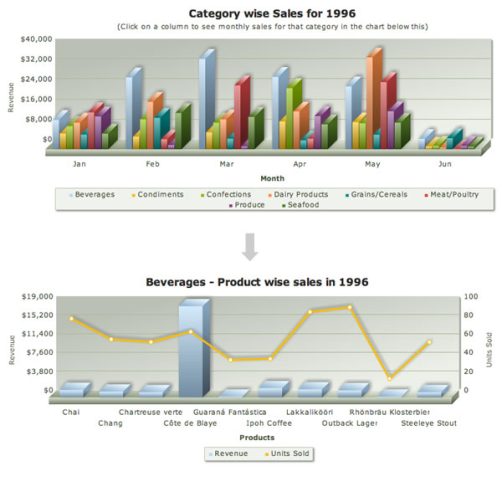
2. Understand what chart type is needed at each level
What type of charts you need to use in drop-downs? It’s a common question we face and answer depends on your analytical requirement.
Say, you need to present total sales over a period of 5 years. You have monthly level sales number too, which you need to plot as drop down chart from yearly chart. Annual sales figures are for visual understanding and periodic comparison. So, you can start with solid columns. You’ll get 5 columns for sales across the years. From each yearly column, you want to plot monthly trend.
At monthly level, you need to present the trend. With columns, trend won’t be easier to comprehend visibly. Solution is line-charts. Lines offer excellent visuals of trending data. So, depending on your analytic need you can choose from column, line, pie and other few chart types.

However, when you have same analytical need across different categories it’s better to use similar chart type. With same chart types you get a uniform style throughout your report. Too many experiments with chart type often cause detraction too.
3. How much you should stuff your chart?
Say, you are dealing with time-series data. How many of data-set are there in a single interval? Similarly, for category-wise charts, you must know size of category set. It helps to keep your chart clutter-free. Too many data-points within a cramped chart create visual nausea. Ensure that you have allotted enough free space to make things visually clean and pleasing. After all, clean chart helps neat interpretation.

4. Clearly indicate the chart has drill-down
This is funny but very common mistake we do with drop-down charts. Often audience passes through drop-down charts without knowing their usability. Unless it’s written clearly, it is not easy to differentiate a drop down from normal charts. So, you must always clearly mention.
You can use top free space to clearly indicate that user can drill down into the chart. Do you suspect people may not know how to drill down? In that case; you can do with “Click on a column to drill-down to monthly sales in the chart below”.
However, things will get complex when you’ll deal with more categories and complex charting.
Say, you have a drill down chart, where child chart opens up by side of the parent chart or below the parent chart. Simple “point your cursor on specific column” won’t work here. You’ll need more descriptive message or instruction.
For example, you need to prepare a dashboard, where you have total revenue numbers for different categories. There again you have further drop down from annual revenue figures to liner trend charts for months. You will need to give a caption like “Please select category to see category-wise sales and drop down further to monthly line chart”.

5. Use breadcrumb-style captions
Breadcrumbs are a navigation tools primarily used in websites, apps and documents. It helps to keep track of site map. Where you are and how you can jump to somewhere else.

On simplistic single chart interface, nobody gets lost. However, with too many drop-down charts, it is quite is easy to lose track. Breadcrumb style can be useful here with central links to different categories. However, breadcrumbs are not very common with time-series data. You won’t see much drop-down charts with breadcrumb link flow from year to quarter to month. Category-wise charts are more with breadcrumb style. Get an insight into interactive JavaScript Charts for your web pages and web applications by FusionCharts.com