November 18, 2022

#Infographic: Logo design evolution

19th Century Pepsi

One of the most common uses of design skills is the production of logos. Companies pay a lot of money and designers often put in a lot of time perfecting the brand image that will be on display for years, even decades at a time.

Of course, sometimes it’s necessary to shake things up, to refresh the logo into something that is more modern. Particularly when a brand is around for decades, the old model can become outdated relatively quickly. Other times, a logo redesign is considered to be symbolic, a representation of great things to come.

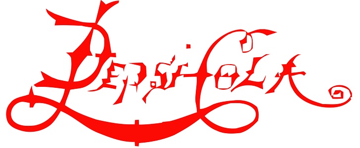
Some companies like to go intricate, as Pepsi has done for quite a while. Others, particularly small businesses, are going clean and basic like Carson City Toyota with their modern logo look.

In this infographic from Glow Internet, we can see some of the most popular brands in the world and how they’ve changed over the years.

Logo Design Evolution Infographic

Disclosure:

Some of the links in this article are affiliate links and we may earn a small commission if you make a purchase, which helps us to keep delivering quality content to you.

Connor Livingston

Connor Livingston is a tech blogger who will be launching his own site soon, Lythyum. He lives in Oceanside, California, and has never surfed in his life.

One thought on “#Infographic: Logo design evolution

Leave a Reply

Your email address will not be published. Required fields are marked *

Similar Stories

Apple to Bring AI Features and Spatial Content App to Vision Pro – Report

Apple to Bring AI Features and Spatial Content App to Vision Pro – Report

February 16, 2025

Apple (AAPL.O) is preparing to roll out major AI-powered enhancements to its Vision Pro headset, including a new spatial content...

6 main elements of beautifully designed smartphone apps

6 main elements of beautifully designed smartphone apps

January 30, 2024

The importance of mobile design really cannot be exaggerated these days. In 2014, 60 percent of web traffic came from...

#Infographic: How design and love come together

#Infographic: How design and love come together

November 16, 2013

If you start a sentence off with "Love is like..." you don't often end it with "...being a designer". Then...