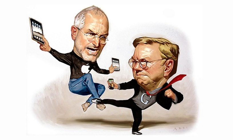
As Google and Apple continue to grow in the mobile market, Android and iOS are quickly becoming the predominant operating systems for phones and tablets. There are many statistics to look at and comparisons to be made. Here, we present a visualization tackling the debate.
Thanks to our friends at Hunch, we now know that Android users are 10% more likely to be men. We know that iOS users are 50% more likely to have been on the internet before 1992. We know who is more likely to prefer General Tso’s Chicken over Pad Thai. It may not be the most important demographic data, but it’s definitely interesting.
Click to enlarge. IClarified


17 User Comments
egiova
The stats on this infographic sucks. They made it in NYC surely… 50% users with an iPhone? Have you seen the price of the caprice? No way.
Noreply
122%? More than everyone in the survey? Amazing.
Cameron Black
You obviously cannot understand what was written. Amazing.
Eren Güncü
lmaoed here, epic fail survey again, many ‘smart’ tech sites did surveys like this and all were failers why you did same shit. %50 of iphone users used internet before 1992, ahaha, can u really say that also for %50 of worldwide iphone users? i tell you that, %50 of iphone users even dont know how to install an application when they grap their phones.
waste of time. spesific group surveys for worldwide technologies and what we should understand from this useless fight? if i spend over 200k dollars in a year how that prove an software better than other one, please for sake, spend your times for better things like *fap fap*
ErikVeland
Android users:
100% more likely to fail to understand an infographic.80% more likely to be offended by an infographic
60% less likely to understand the difference between “more likely” and “of total”
Luis Angel Gonzalez Jr.
Don’t be an ass, dummy.
NeoDra
Android is rising now
it may beat ios in the future
Stinkipete
Absolutely awful. More information, and a few actual GRAPHICS are required for this “inforgraphic.” The statistics presented need some context, or some figures behind them. “10% more likely to be men” and “18% more likely to be women” is an awfully unclear way to put it.