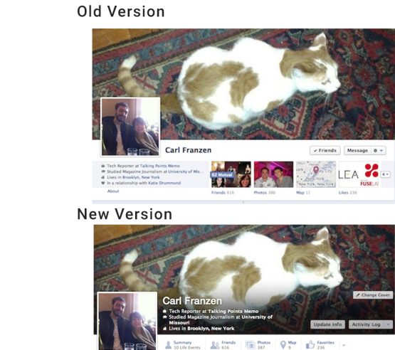
Facebook gives itself a facelift by improving the user experience yet again. Facebook’s Timeline, which was implemented back earlier in the year, was given the digital makeover by compressing the user profile across the cover photo. Previous Timelines were bulky and gaudy, with large tabs under the cover photo where profile visitors could cruise a user’s profile. Timeline has now designed the user’s profile to be subtle and manageable but does this improvement really do anything for the Facebook experience?
With millions of dollars in revenue from the Facebook IPO and all the publicity that Zuckerberg has been getting from his recent marriage, it amazes me what kind of attention is given to the little changes that Facebook goes through for the user experience. Why can’t the user experience be controlled by the user? Why does the site need to be cosmetically transformed on a regular basis if it is my site to configure?
Facebook has been adjusting their site since their establishment so many years ago and it is evident that the social media site has come a long way. From updates to Timelines to IPOs, Facebook has proven that it is willing to change with the times and make the adjustments it feels are necessary but what about me?
Facebook is a social media site like no other but it’s time that the user takes the improvements and the configurations back into their own hands. I can handle change but I like my stuff where it belongs.


